Visual Design
User Experience Design

Do you have a question?
Visual Design
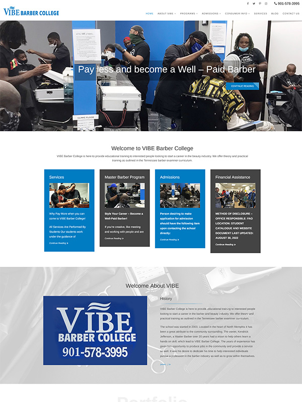
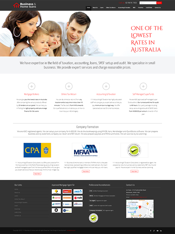
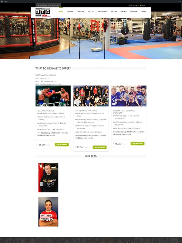
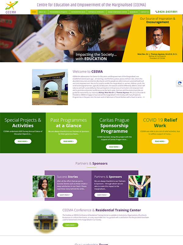
If User Experience Design is about the creation of a philosophy about how to treat visitors and customers to your website, then Visual Design is all about the creation of a philosophy about how to make a great impact on those visitors and customers. Visual design is also commonly called graphic design or communication design (sometimes also known as visual communication) and represents the aesthetics or the “look-and-feel” of the front end of your website or application.
Visual design has a significant impact on the usability of designs and research has shown that users believe that a more attractive design is easier to use than a less attractive one even when that is not the case. So, first impressions do count and at Excellone Technologies we understand this well. That is why we are focused on delivering quality solutions that not only work great, but also look great.
Our expert user experience professionals leverage superior visual design to convey a message of excellence and performance through the deft usage of visual elements like images, colors, videos and typography. Good visual design does more than improve your customers’ attitudes to your website, good visual design will actually make your website or app easier to use. Some of the key principles of visual design that we focus on to improve aesthetics, enhance customers' experience and improve usability are given below:
- Contrast: Clever use of contrast helps to direct visitors to what is important and helps them focus on the next steps to take.
- Subtractive design: Subtractive design principle eliminates all visual element that do not contribute directly to visual communication.
- Consistency: Consistency is all about presenting information in similar ways, like through same fonts, icons, links, headings and so on.
- Visual hierarchy: A visual hierarchy of users' tasks is made and important tasks are given visual prominence through colour, size and relative position.
- Alignment: By designing the interface to an underlying grid alignment can be achieved - making sure all design elements line up horizontally and vertically.
- Affordance: Good affordance is simply about helping users easily determine what action needs to be taken with the various objects on your website or app.
- Proximity: Proximity is all about placing the elements close to each other in such a way that users will perceive them to be related to each other and hence be able to find things easily.
- Visual scheme: A good visual scheme uses white space to create visual "breathing room", maps to the user model and allows users to customise the interface.
Frequently Asked Questions (FAQs)
What is the importance of visual design for my brand?
Visual design helps establish a strong brand identity, enhances user engagement, and ensures a memorable user experience that aligns with your business goals.
How does Excellone approach visual design projects?
We combine creativity with a user-centric approach, focusing on your brand's vision, audience needs, and best design practices to deliver impactful visual designs.
Can you redesign my existing website or app?
Yes, we can refresh and enhance your existing digital assets to improve visual appeal, user experience, and overall functionality.
What tools and technologies do you use for visual design?
We utilize leading design tools like Adobe Creative Suite, Figma, and Sketch, along with the latest UI/UX design trends, to create visually compelling and functional designs.

